Horizontal/Vertical Illusion Experiment Results
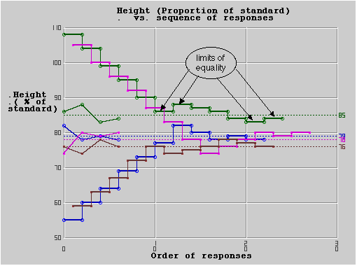
Next, your data is presented as a graph. All the data for a series is shown in the same color. The data is presented as a graph showing the length of the vertical as a percentage of the length of the horizontal for each step of the adjustment (the heavy lines), the four values at direction changes (the lighter lines), and the mean of these four values for each of the adjustment series (dotted lines). All the data for a series is shown in the same color.